


Hello and welcome to my blog. Today, I am participating in the New at SU! blog hop. We are a group of Stampin' Up!® demonstrators from around the world who are full of creative papercrafting ideas to share with you to get you crafting. For this hop we are exploring Two - Tone cardstock.
Two-tone cardstock has been around for a while but i have to admit that I don't use it as much as I should! It's a great product to have in your stash. One of the things that Stampin' Up! is well known for is the coordination throughout their range of products. Two-tone card stock expands the coordinated range.
This description comes straight from the website:
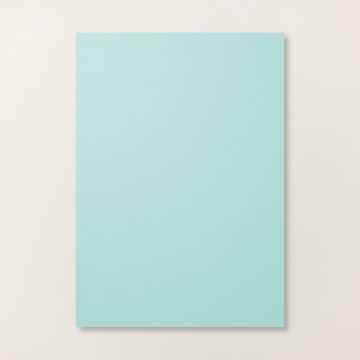
Our 12" x 12" (30.5 x 30.5 cm) Two-Tone Cardstock is great for handmade cards and other paper crafts. It’s high quality, acid free, and lignin free, making it a favourite scrapbook paper, too.
This cardstock is two-tone meaning one side is the full-strength colour and the other side is a lighter version of the colour. The ultrasmooth surface makes it an ideal paper for stamping, giving you clean, crisp images.
It is available in both single colour packs and mixed colour packs (which coordinate with Scrapbook Workshop kits and are a great way to collect a variety of colours!).
The simplest way to utilise two-tone card is to use it to create a graduation of colour when building layers on a card or scrapbook layout. Not only do you have the dark and light sides of the two-tone card, there is also a slight colour variation when you compare them to regular A4 card.
.jpeg)
The real magic of two tone card becomes apparent when it is altered to expose the white core layer. After using an embossing folder the white core can be exposed my sanding off the very top layer of the card. Distressing the edges of die cuts or layers using the blades of your scissors will also expose the white core. Another way to achieve interest is by tearing the two-tone card thereby creating a rough, white edge.
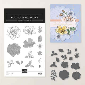
I decided to use the Bloom Boutique bundles to create my project - the flowery scallops together with the blousy flowers really spoke to me. I can just smell the scent of the flowers on a hot summery day!
.jpeg)
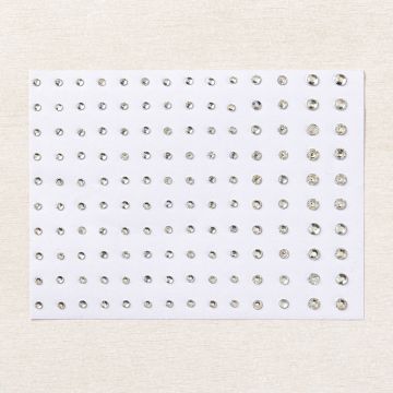
The first card I created focuses on a graduation of colour between the layers - there are three subtle shades of Pool Party card plus some tone on tone stamping to create the background. The Happy Birthday is stamped in Pool Party on Basic White card and fussy cut to create a delicate sentiment. The embellishments are a large loopy Bakers Twine bow, a few white die cut leaves and Basic Gemstones to add a little sparkle.
For my second card, I used the same layout but I incorporated an embossed layer which I sanded to expose the white middle layer. I also dragged the blade of my scissors along the edges of the layer to rough them up too. I kept the finishing touches the same!
.jpeg)
I hope that you have been inspired by my project today and that you'll have a go at creating a project that incorporates some two-tone elements. Continuing along the hop to the others will provide you with even more project ideas - you are currently with me, Furry Cat Designs by Karen Henderson - but before you hop on to the next post, please take a moment to leave a comment. We love reading your comments!
Do you need any of the products used on today's cards? If you live in the UK please take a look in my online Stampin' Up! shop. You can follow the link or click on the pictures below of the products I have used today.
Stay safe and as always, happy crafting,

If you would like to order any supplies, and you live in the UK, I would love to be your demonstrator. To place an order please visit my online shop HERE. The products I have used on today's project are linked from the images shown below.
Stampin' Rewards Program

When shopping, remember to opt in to Stampin' Rewards on orders over £20.
Click on the images of the products I have used today to purchase them in my online shop:


Both cards are stunning! But I love how you "exposed" the white center with the embossing folder and sandpaper! Such a nice touch!!
ReplyDeleteThanks Rachael
DeleteHoly Smokes! You've captured so many features of Two Tone card stock in one GORGEOUS card: dual shades (of beloved Pool Party), the white core (peeking through the embossing) and it's two-toned perfection.
ReplyDeleteThe two-tone card let's the shabby chic shine right through!
DeleteWow, the monotone really shines when using the double side and white core, love what you've done to give it dimension!
ReplyDeleteThanks Rachael
DeleteGorgeous cards and so well done in monotone! I always struggle with monotone cards and I should have been using two-toned all along!! Thanks for sharing!
ReplyDeleteMonotone sounds quite plain, but hopefully I've shown that it doesn't have to be!
Deletelove the monotone style Karen and so elegant. Zoe x
ReplyDeleteMany thanks Zoe
DeleteTone on tone to the max! Love your card! So soft, elegant and subtle!
ReplyDelete