


Hello and welcome to my blog. Today, I am participating in the New at SU! blog hop and this month we are focusing on the new InColors. We are a group of Stampin' Up! demonstrators from around the world who are full of creative papercrafting ideas to share with you to get you crafting.
.jpeg)
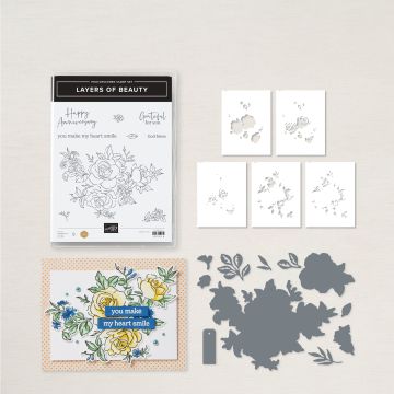
For this month's project I am featuring just one of the delightful new colours - Petunia Pop and crearting a card using the wonderful Layers of Beauty bundle. Previously, I have enjoyed creating with a similar bundle called Enduring Beauty, so I was pretty sure I would love using the Layers of Beauty too. There are stamps, dies and masks to help you with the colouring - using the masks together with Blending Brushes raises the colouring level to artist grade effortlessly.
.jpeg)
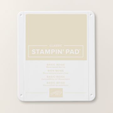
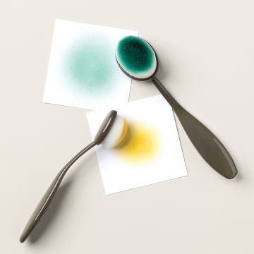
I had a lot of fun experimenting with the largest stamp and the masks. I am sharing two versions. The first has the outline image stamped in Basic Beige, which creates a faux no-line watercolouring effect, where the lines melt into the petals becoming much less visible. I added colour to the petals using a large blending brush and Petunia Pop ink. The petals are formed in three layers and with each additional layer the colour intensifies. I used a very light touch giving a very pale overall finish.
.jpeg)
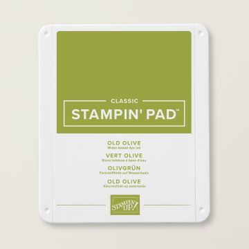
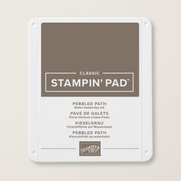
The leaves are created in two layers using Old Olive ink, which to my eye looks very rose-like. For my next version I used the same colours for the petals and leaves but the outline is stamped in Pebbled Path ink. It is dark enough to see clearly but not as harsh as Memento Black ink and adds a beautiful definition to the petals.
.jpeg)
The large image is trimmed using the coordinating die and mounted using dimensionals on to two nesting layers of Petunia Pop; the layer embossed with the Exposed Brick folder is just slightly smaller. I used some of the bonus dies to cut out some additional white leaves which are tucked in underneath the coloured foliage for added texture, added a sentiment (from Best Family Ever and die cut with a Stylish Shapes banner) and some Shimmer Gems to complete the cards.
I hope that you have been inspired by my cards today. Continuing along the hop to the others will provide you with even more project ideas - you are currently with me, Furry Cat Designs by Karen Henderson - but before you hop on to the next post, please take a moment to leave a comment. We love reading your comments!
Do you need any of the products used on today's cards? If you live in the UK please take a look in my online Stampin' Up! shop. You can follow the link or click on the pictures below of the products I have used today.
Stay safe and as always, happy crafting,

If you would like to order any supplies, and you live in the UK, I would love to be your demonstrator. Use the current hostess code (May 2024 code: MQ2V6VWV) to get some free product (it will follow in the post after the end of the month). If your order is over £150 do not use the code as you become the hostess and get the rewards. To place an order please visit my online shop HERE.
If you would like to join my team, you can choose your starter kit HERE and if you have any questions, please contact me at furrycatdesigns@gmail.com
Click on the images of the products I have used today to purchase them in my online shop:
Rembember to use the current hostess code.
May 2024 code: MQ2V6VWV


Beautiful cards, Karen! I love how the extra layers under the die cut looks. Pops it up a bit more while adding support. Thanks for sharing this!💕
ReplyDeleteThanks Jan - I can't resist adding those extra details!
DeleteThese are gorgeous, Karen. While both versions are beautiful, I think I marginally prefer the Basic Beige outline giving the no line effect!
ReplyDeleteThanks Heather - I love the way the Basic Beige does give a realistic representation!
DeleteWOW! I love seeing the difference between inks! It truly is amazing! Great job!
ReplyDeleteThanks so much Rachael - once you start experimenting with the colours it is hard to stop. I have tried lots more colour combos!
DeleteThat Petunia Pop makes good on it's promises! Truly lovely card!
ReplyDeleteThanks Loni. So please you like it!
DeleteLove how you used Basic Beige to create the Faux Watercolor look! Both cards are gorgeous!
ReplyDeleteThank you! Basic Beige is such a useful colour!
DeleteLove everything about your cards especially the basic beige one... Love the intensity of the Petunia Pop with every layer of ink. Cheers Shaz
ReplyDeleteThank you! Using the same colour for all the layers is the ultimate in coordination!
DeleteGorgeous!!!!! love the beige outline! perfect cards!!!
ReplyDelete